


Today is a day to look back on our journey, to where we’ve come from, to what makes us unique and also to what lies ahead of us. Today, after almost a decade in the market, Capnamic is rebranding itself.
Since our inception in 2012, many things have happened. And many things have changed. We’ve raised two funds to back outstanding entrepreneurs and early-stage startups from the German-speaking regions. We’ve experienced how difficult, tiring and lengthy fundraising can be with our first fund, which took us almost two years to finally close – a lesson we never forgot when dealing with founders during their own fundraising processes.
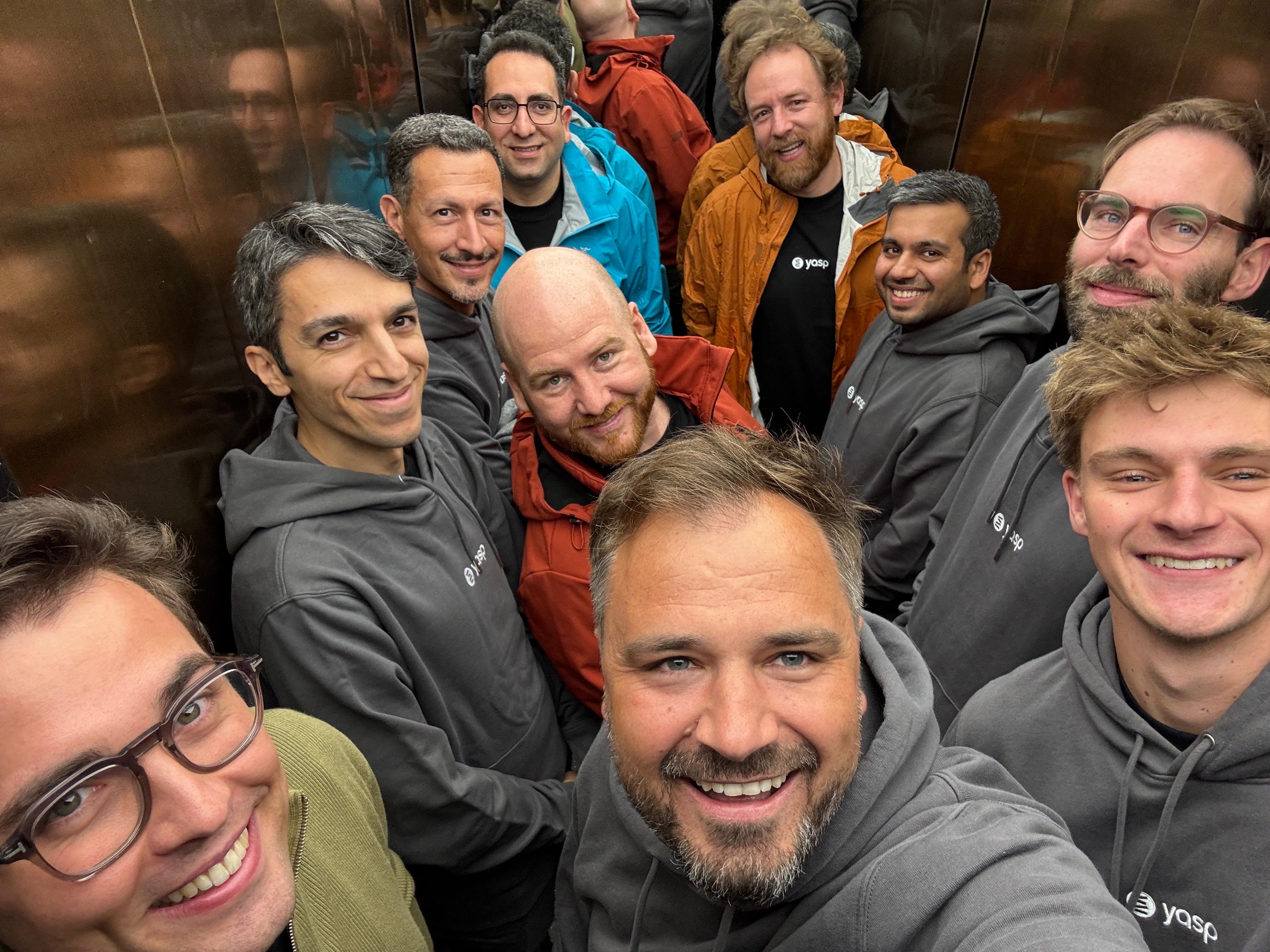
With the trust of our growing LP base, we were fortunate to invest in some of the most outstanding tech companies from Germany. We learned that a category leader doesn’t have to come from Berlin (Chemnitz and Bonn are not so bad after all, right LeanIX and Staffbase?). We found a sweet spot with B2B Software-as-Service companies, but also closed some great deals outside of this segment. Lastly, we found loyal partners, friends and teammates, many of whom have been with us since day one. And a lot of great people joined us on our journey to make up our unique and fun-loving team.
We expanded and we grew up while our name and look stayed the same.
We have to be honest, we’re still a bit in love with our old brand. It has served us well over so many years and we’ve grown very close with it. But it felt like your favorite hoodie you bought as a teenager: over time, it has become a bit too worn out and too small. Today, we’re not the same Capnamic any more that we were back in 2012. We’ve matured. And we need a brand that reflects this. That’s why we’re absolutely thrilled to introduce you to our fresh - new - look:
An introduction to our new brand
With our new visual identity, we’re highlighting our uniqueness. While you might find a good amount of VCs with blue or red as their brand colors, we decided to go for a vibrant and eye-catching electric yellow. We’ve matched this with a bold, unique font to create a look which fits to our character as a team and VC.

To quote Lead Designer Atanas Teodosiev from Fiction Design: “We created a visual language that captures the excitement of building the future and focuses on bringing exceptional people forward, as they are tomorrow's pioneers.”
We also touched up our wordmark to emphasise the core attributes that have always - and will always - define Capnamic: Giving capital to some of the most promising and exciting startups out there is at the core of every VC firm. But we aim at being different, at having a startup mindset while being a VC, at working on eye-level and respectfully with founders; ultimately, at being the first one founders call when times are tough. This is what is summed-up in our dynamic support. Our new wordmark marries these two qualities - Cap & namic - in a subtle and elegant way.

With this step, we’re hanging up our favorite hoodie in the closet. It’s time for this new suit to accompany us on our path to another level of growth in the years to come.
.jpg)

.png)


.avif)


.avif)


.avif)


.avif)
.avif)

